Design System Development for Consistent Products
Design system development that aligns design and engineering, speeds up shipping, and keeps products consistent across every platform and touchpoint.
faster feature development with design systems
improvement in UI consistency across products
typical ROI timeline through increased velocity
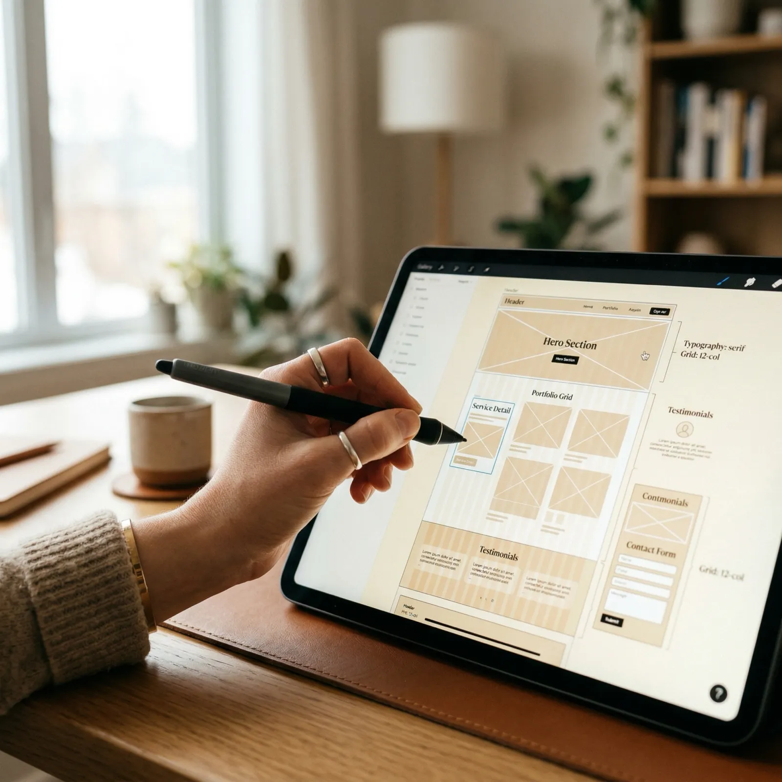
Design System Design & Implementation
We create design systems that become a single source of truth for your product's visual language and interaction patterns.
Single Source of Truth
Eliminate fragmentation with a unified design language, shared components, and consistent patterns that scale across your entire product ecosystem.
Accelerated Velocity
Ship features 40-60% faster by eliminating redundant work, improving collaboration, and enabling parallel design and development workflows.
Unified Design Language Across Products
Establish a cohesive visual and interaction language that creates consistency across all your digital products and platforms. Our design systems eliminate fragmentation, strengthen brand recognition, and ensure every user touchpoint feels like part of the same family—whether on web, mobile, or native applications.
Accelerated Development Velocity
Ship features 40-60% faster by eliminating redundant design and development work. With pre-built, tested, and documented components, your teams spend less time reinventing wheels and more time solving unique product challenges. Our systems transform months of work into weeks through intelligent reuse and clear implementation patterns.
Design-Development Collaboration Excellence
Bridge the gap between design and engineering with shared language, reusable components, and aligned workflows. Our systems create a common foundation that eliminates miscommunication, reduces implementation drift, and ensures what designers create is exactly what engineers build—every single time.

Built-In Quality and Accessibility
Embed accessibility, usability, and quality standards directly into every component so teams build inclusive, high-quality experiences by default. Our systems enforce WCAG compliance, responsive design, performance optimization, and interaction patterns that delight all users—making excellence the path of least resistance.
Design System Foundations
The core building blocks that power consistent, scalable product experiences
Design Tokens
Platform-agnostic design decisions (colors, typography, spacing) defined once and transformed into code for every platform automatically.
Component Library
Reusable UI components from atoms to organisms, designed with variants, states, and responsive behaviors baked in.
Documentation
Comprehensive usage guidelines, code examples, accessibility specs, and best practices for every component and pattern.
Pattern Library
Common UI patterns and templates for forms, lists, dashboards, and workflows built from system components.
Accessibility Standards
WCAG 2.1 AA compliance built into every component with keyboard navigation, screen reader support, and inclusive design.
Governance Framework
Clear contribution processes, versioning strategies, and change management to keep your system healthy and evolving.
Trusted by Product Teams Worldwide


Design Systems Driving Real Results
See how we've helped product teams scale design and development with reliable design systems.
SaaS Platform Design System
CloudMetrics Analytics
Comprehensive design system for a fast-growing B2B analytics platform. Unified 4 product lines, 12 engineering teams, and 200+ screens under one cohesive system with reliable component library, design tokens, and governance framework.
Technologies
Our Design System Process
A collaborative, strategic approach that ensures adoption and long-term success
Discovery & Audit
Analyze your existing products, design patterns, component usage, and team workflows. Conduct stakeholder interviews, inventory current components, identify inconsistencies, and define system scope and priorities based on business impact.
Deliverables
Design Foundations & Tokens
Establish core design principles, visual language, and design tokens that form the foundation of your system. Define color palettes, typography scales, spacing systems, shadows, borders, and interaction patterns.
Deliverables
Component Design & Documentation
Design comprehensive component library starting with high-priority atoms (buttons, inputs) and progressing to complex molecules and organisms (forms, cards, navigation). Document usage guidelines, variants, and states for each component.
Deliverables
Development & Implementation
Transform designs into production-ready code components with proper TypeScript typing, accessibility features, and framework integration. Build tooling for token transformation, version management, and documentation generation.
Deliverables
Documentation & Guidelines
Create comprehensive documentation covering component usage, accessibility guidelines, design principles, contribution workflows, and governance processes. Build living documentation site with interactive examples and code snippets.
Deliverables
Training & Adoption
Enable teams through training sessions, workshops, office hours, and ongoing support. Establish champion networks, feedback channels, and continuous improvement processes to ensure successful adoption and evolution.
Deliverables
Components & Patterns We Build
From atomic components to complex patterns, everything you need to build products
Atomic Components
- Buttons, links, and CTAs with all states and variants
- Form inputs, selects, checkboxes, and radio buttons
- Typography system with semantic heading hierarchy
- Icons, badges, tags, and labels
- Color palettes and design token system
- Spacing, shadows, and border styles
Complex Patterns
- Navigation systems (headers, sidebars, breadcrumbs)
- Data tables with sorting, filtering, and pagination
- Modal dialogs, drawers, and overlays
- Form patterns and multi-step wizards
- Card layouts and content containers
- Dashboard layouts and data visualization components
Complete Design System Deliverables
Everything you need to scale design and development across your organization
Figma Component Library
Fully organized Figma library with master components, variants, auto-layout, and design tokens. Includes all component states, responsive behaviors, and comprehensive documentation.
Production Code Components
Framework-specific component library (React, Vue, Angular, Web Components) with TypeScript types, accessibility features, and comprehensive testing coverage.
Design Token System
Platform-agnostic design tokens for colors, typography, spacing, and more. Includes transformation pipeline to generate platform-specific code (CSS, iOS, Android).
Living Documentation Site
Interactive documentation with live component examples, code snippets, usage guidelines, and accessibility documentation. Searchable and version-controlled.
Pattern Library & Templates
Common UI patterns and page templates (forms, dashboards, lists, detail pages) built from system components with best practices baked in.
Accessibility Guidelines
Comprehensive accessibility documentation covering WCAG compliance, keyboard navigation, screen reader support, focus management, and testing procedures.
Governance Framework
Contribution guidelines, review processes, versioning strategy, deprecation policies, and change management procedures to keep your system healthy.
Implementation Roadmap
Prioritized rollout plan, migration strategies for existing products, success metrics, and timeline for initial adoption and ongoing expansion.
Tooling & Automation
Automated token transformation, linting rules, CI/CD integration, visual regression testing setup, and version management tooling.
Related Services
Explore our full suite of UI/UX design services to create exceptional digital experiences
UI Design
Create beautiful UI components and visual design that form the foundation of design systems.
UX Research
Validate design system components with user research and usability testing.
Wireframing
Define component structures and patterns through systematic wireframing.
Prototyping
Build interactive prototypes using design system components for rapid iteration.
Website Design
Apply design systems to create consistent, scalable website experiences.
Digital Consulting
Strategic consulting to plan design system adoption and organizational change.
What Product Teams Say
Real feedback from teams who transformed their workflows with design systems
“The design system transformed how our product team works. We went from taking weeks to build features to shipping in days. The consistency across our platform is night and day compared to before.”
Jennifer Park
VP Product at CloudMetrics Analytics
“Verlua didn't just deliver a component library—they built us a complete system with governance, documentation, and training that our entire org has adopted. Best investment we made this year.”
Marcus Thompson
Head of Design at Urban Lifestyle Brands
“The accessibility-first approach means we ship inclusive products by default. Our WCAG compliance went from 60% to 100%, and our engineering team loves how well-documented everything is.”
Sarah Chen
CTO at Wealth Management Platform
Adoption & Governance
A design system is only valuable if teams use it. We build adoption and governance into every engagement.
Driving Adoption
- Team training and workshops for designers and developers
- Champion programs and internal advocacy networks
- Phased rollout strategies that minimize disruption
- Regular office hours and ongoing support channels
Governance Framework
- Clear contribution processes and review workflows
- Versioning strategy and deprecation policies
- Change management and communication protocols
- Success metrics and continuous improvement loops
Frequently Asked Questions
Everything you need to know about design systems and our services
What exactly is a design system?
A design system is a comprehensive collection of reusable components, design patterns, guidelines, and standards that define how your product looks and behaves. It includes UI components (buttons, forms, cards), design tokens (colors, typography, spacing), documentation, code libraries, and usage guidelines. Think of it as the single source of truth for your product's design language that ensures consistency across all platforms and touchpoints.
How long does it take to build a design system?
A foundational design system typically takes 8-12 weeks to establish, covering core components, design tokens, documentation, and initial implementation. More comprehensive systems with advanced components, multiple platforms (web, iOS, Android), and extensive pattern libraries may take 12-16 weeks. We start with high-priority components that deliver immediate value, then expand iteratively based on your product needs and team velocity.
Do we need a design system or just a component library?
A component library is just one part of a complete design system. While a component library provides reusable UI components, a design system includes the underlying principles, design tokens, patterns, guidelines, accessibility standards, and governance that make those components work cohesively. If you want true consistency and scalability, you need the full design system—not just isolated components.
How do you ensure our design system gets adopted by the team?
Adoption is built into our process from day one. We involve designers and developers early, create comprehensive documentation with live examples, provide training sessions and workshops, establish clear governance processes, and build tools that make using the system easier than not using it. We also implement gradual rollout strategies, champion programs, and regular feedback loops to ensure the system evolves with your team's needs.
Can you integrate with our existing tech stack and tools?
Yes — We design systems that integrate smoothly with your existing technology stack. For design tools, we work primarily in Figma but can accommodate Sketch or Adobe XD. For development, we support React, Vue, Angular, web components, and other modern frameworks. We can also integrate with your build tools, CI/CD pipelines, documentation platforms (Storybook, Zeroheight), and version control systems.
What deliverables do we receive?
You receive comprehensive deliverables including: organized Figma libraries with all components and tokens, production-ready code components for your framework, design token definitions (JSON/YAML), complete documentation site with usage guidelines and examples, accessibility guidelines and audit results, governance documentation, component API specifications, and implementation roadmap. All source files and documentation are yours to own and maintain.
How do design tokens work?
Design tokens are the atomic design decisions—colors, typography, spacing, shadows, borders—defined once and referenced everywhere. We define tokens in a platform-agnostic format (typically JSON), then transform them into platform-specific code (CSS variables, SCSS, iOS Swift, Android XML). This means changing a primary color or base font affects your entire product consistently across all platforms with a single update.
What happens when we need to update or expand the system?
Design systems are living, evolving products. We build them with scalability and maintainability in mind, establishing clear versioning, change management processes, and contribution guidelines. You can either maintain it internally using our documentation and governance framework, or engage us for ongoing support, new component development, quarterly audits, and system evolution as your product grows.
How do you handle accessibility in design systems?
Accessibility is foundational, not optional. Every component we create meets WCAG 2.1 AA standards minimum, with support for WCAG 2.2 and AAA where applicable. We build in proper semantic HTML, ARIA patterns, keyboard navigation, focus management, color contrast ratios, screen reader optimization, and responsive touch targets. We also provide accessibility documentation, testing guidelines, and audit checklists for your team.
What ROI can we expect from a design system?
Organizations typically see 40-60% faster design-to-development handoff, 30-50% reduction in design and development time for new features, 60-80% decrease in UI inconsistencies and bugs, and significant improvements in product quality and user satisfaction. The investment pays for itself within 6-12 months through increased velocity, reduced rework, improved quality, and better collaboration. Plus, teams report higher satisfaction and confidence in their work.
Ready to Scale Your Product With a Design System?
Let's build a design system that accelerates development, ensures consistency, and empowers your teams to ship faster than ever before.